Ways to Build Successful Brand In 2021
Is it too early to talk about your business planning for 2021? No, this is the right time to talk ab...


Talk about black or a dark design, most of the designers are afraid to use dark backgrounds in their design. Why? Because the design can be dull or boring. But, there is nothing to be worried about actually. Because with the right colors, gradients, and textures, you can get an impactful and versatile dark design. That why Tiara is here today, to share with all graphic designers how to create powerful designs using dark backgrounds.
Let’s take a tour of this posting on how to create a powerful design using a dark background.
Did you know what is rich black? Rich black is the mixture of solid black with CMYK color. CYMK is broken down to Cyan, Magenta, Yellow, and Black.
You can try these formulas to create your own rich black color.
Cool Rich Black: C=60 M=50 Y=40 K=100
Warm Rich Black: C=40 M=60 Y=60 K=100
According to the formula, there’s no single correct value of rich black because the result can be warmer or cooler by increasing or decreasing the CMYK. So, try it out now to create your own rich black background.
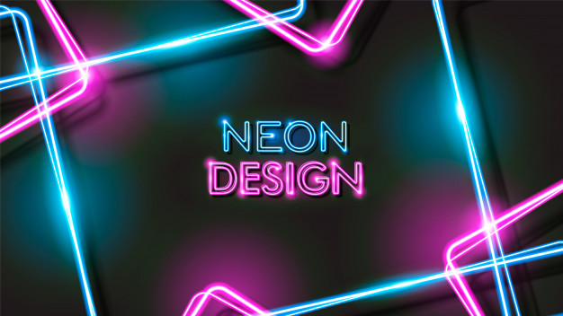
You can try to combine your dark background with neon typography or so on. Combine your dark background with neon typography is such a great technique to keep your dark background punchy and stand out. Here is an example of neon typography with a dark background.

Such a great and attractive design to look for. Try it out now!
Other than that, you also use a monochrome palette to create dramatic backgrounds for your design. Black and white will always be the most perfect combination – timeless and classic. You can use white as a color for your typography or logos and black as a background. Your white typography or logos will look really impactful against the black background. Why? Because the Black and white combination can work perfectly in your design as it is a high-contrast color pairing you can have that can attract people. Here is an example of a monochrome design.

Not only choosing the right typography color for your dramatic backgrounds, but you can also play with the picture you insert in your backgrounds. You can use your dark backgrounds as a blank canvas to make your inserted pictures appear as they are emerging from darkness. Such an effective technique to give your photos a theatrical edge. Here is an example for you.

These are how you can play with your dramatic background to make your design stunning out. You can create a powerful design using a dark background by making your dark background use a rich black formula, combine your dark background with neon typography, use a monochrome palette for your design and make your picture as they emerge from the darkness. So, which one do you prefer to use to create your dark background design? Choose one of the points above and create your own dramatic background design now.